Happease is a brand of CBD products based in the Czech Republic with the primary goal to distribute happiness, by improving the consumer's state of mind and sense of wellbeing.
The client came to us in 2018 with a request to create a visual identity and packaging design for their emerging premium brand, which at that time consisted of only 6 products. Fast-forward to 2021, the brand keeps growing and expanding into more and more product categories.
CLIENT: Honeytime, Prague, Czech Republic
SERVICES: Visual Identity, Logo design, Packaging Design
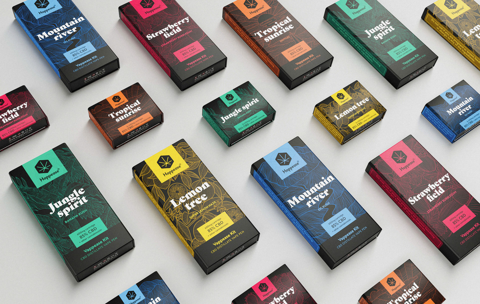
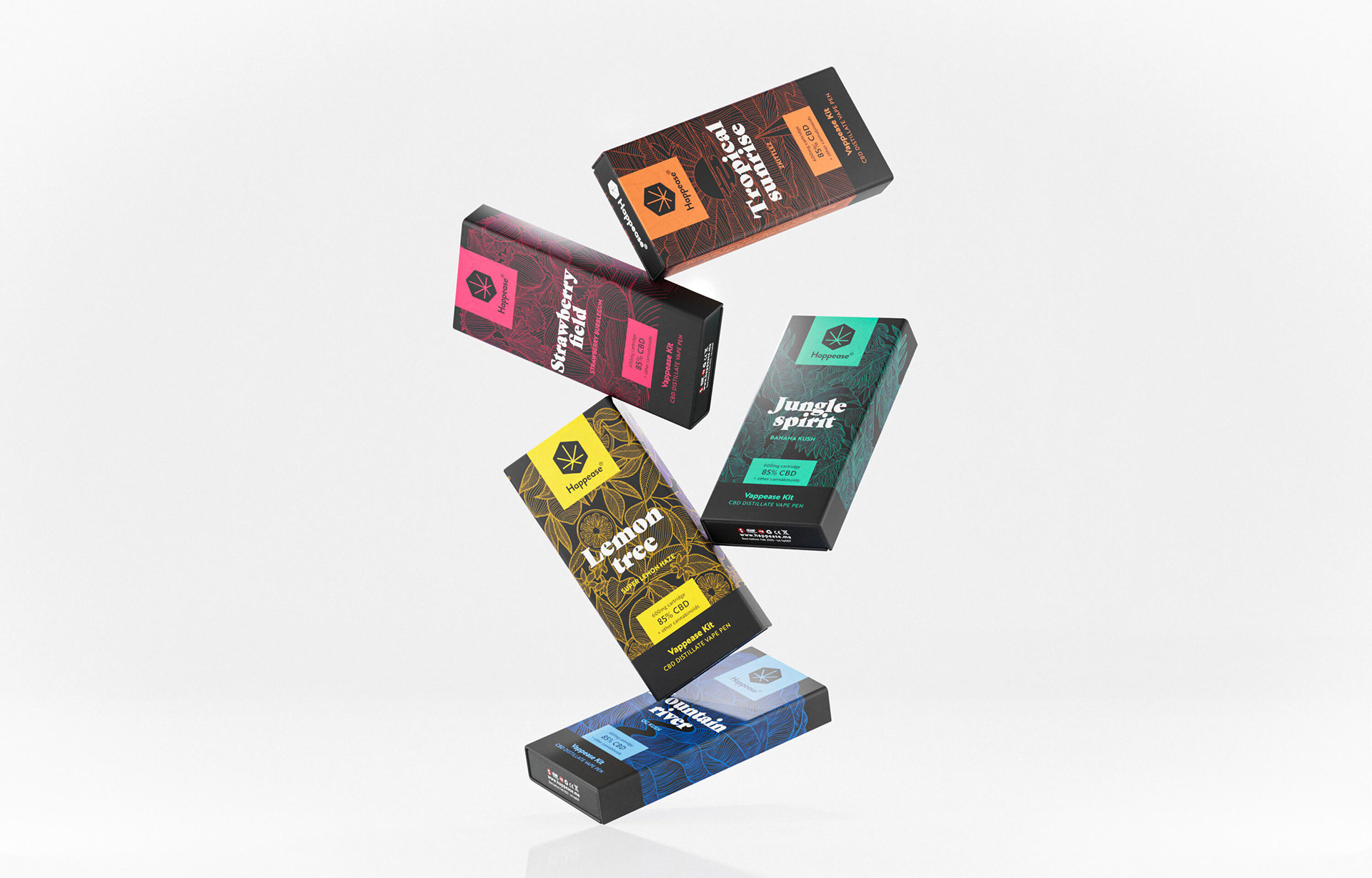
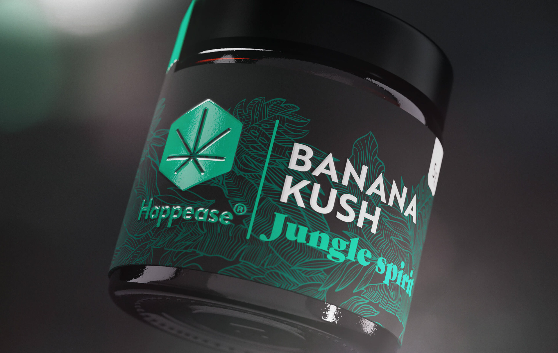
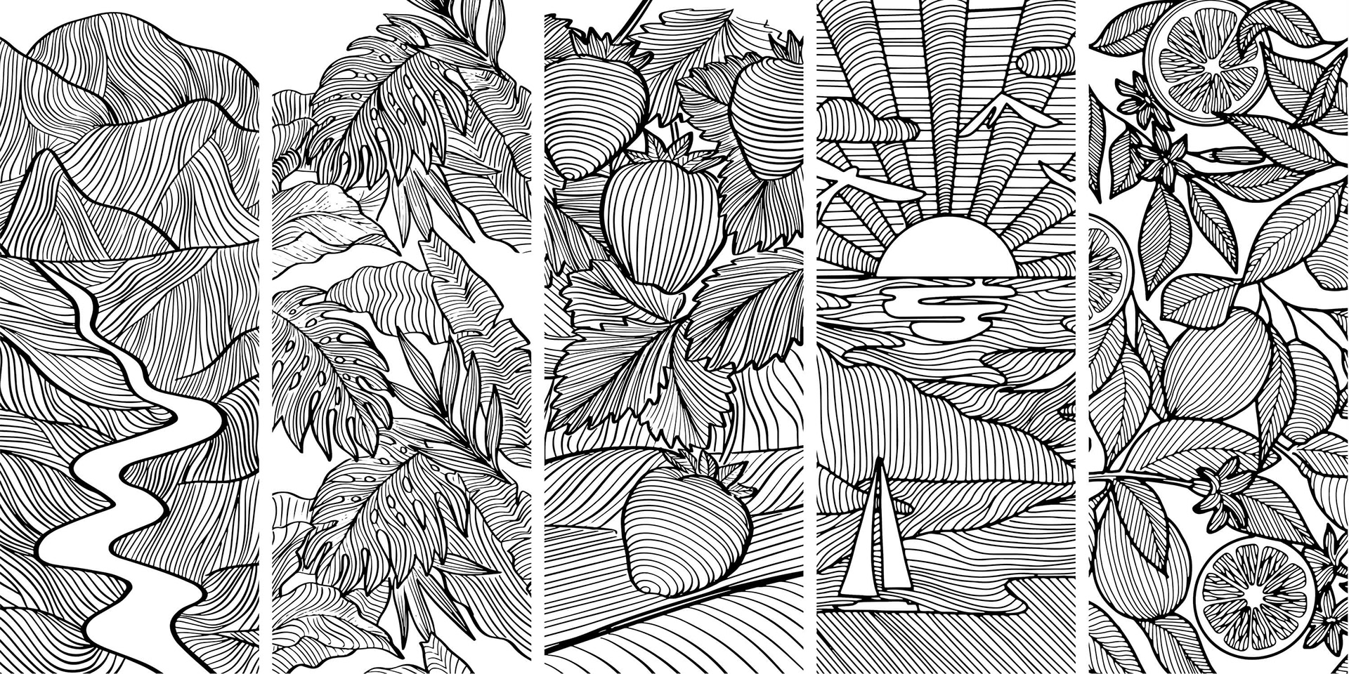
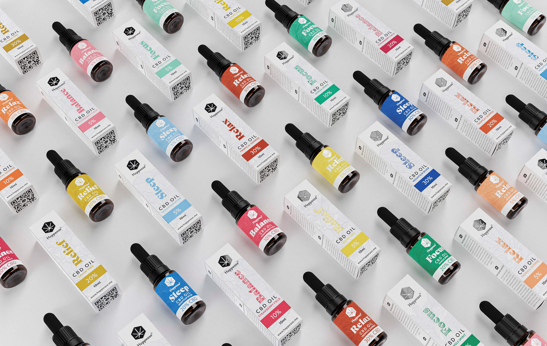
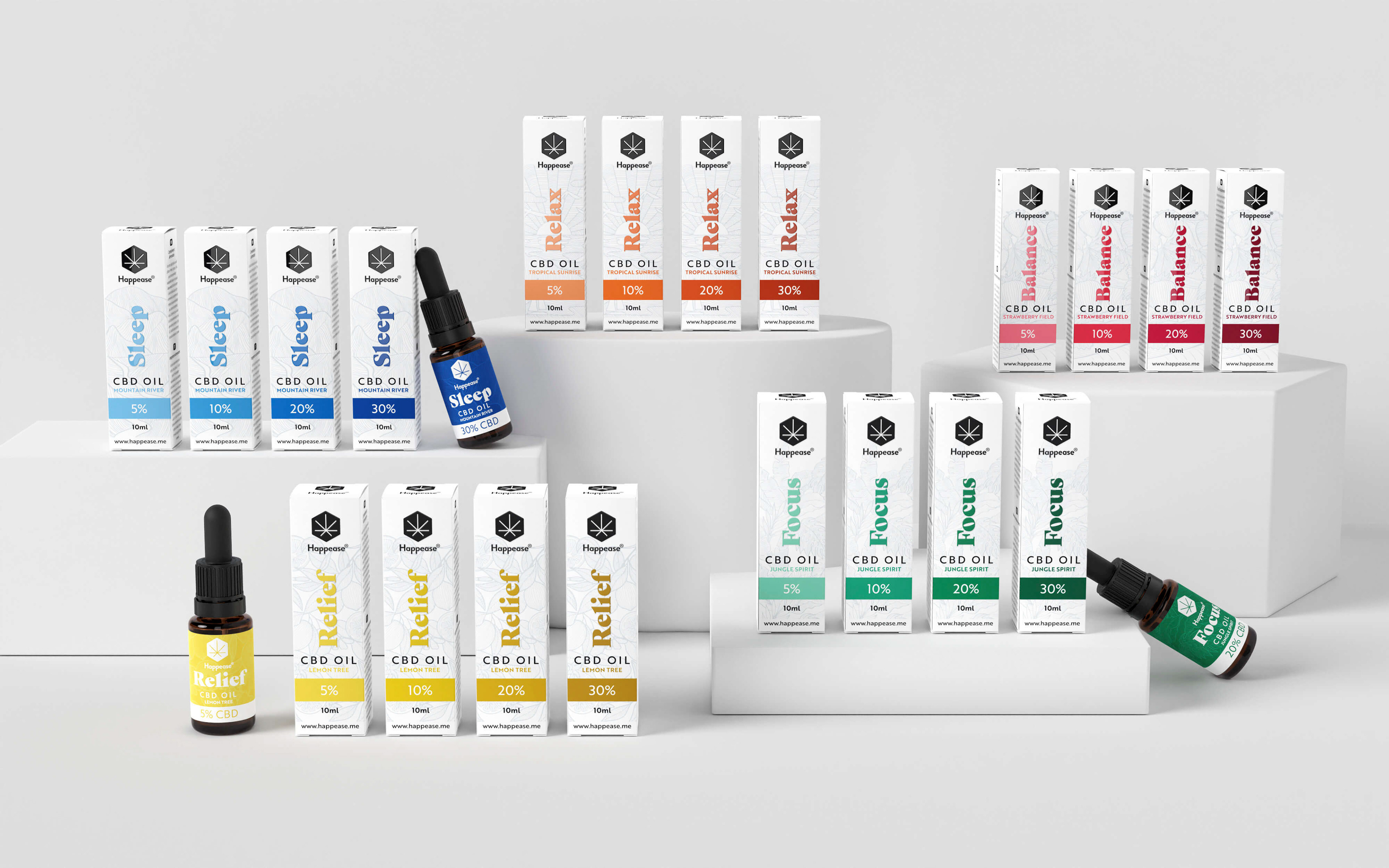
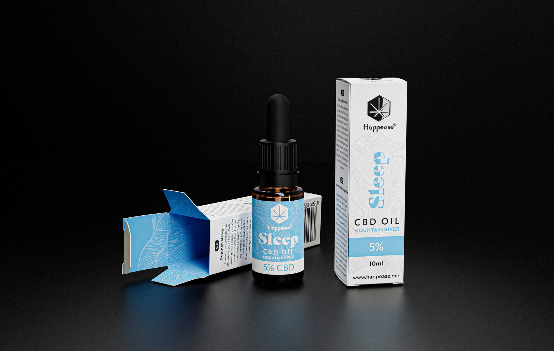
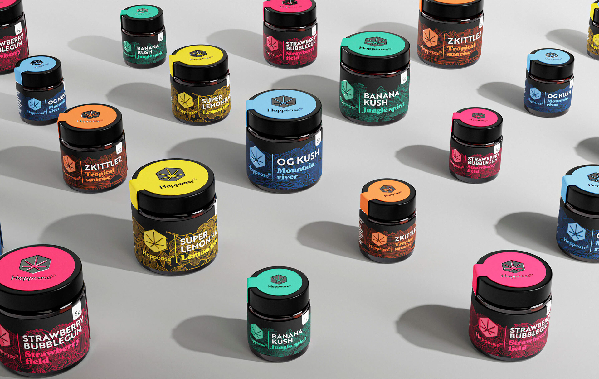
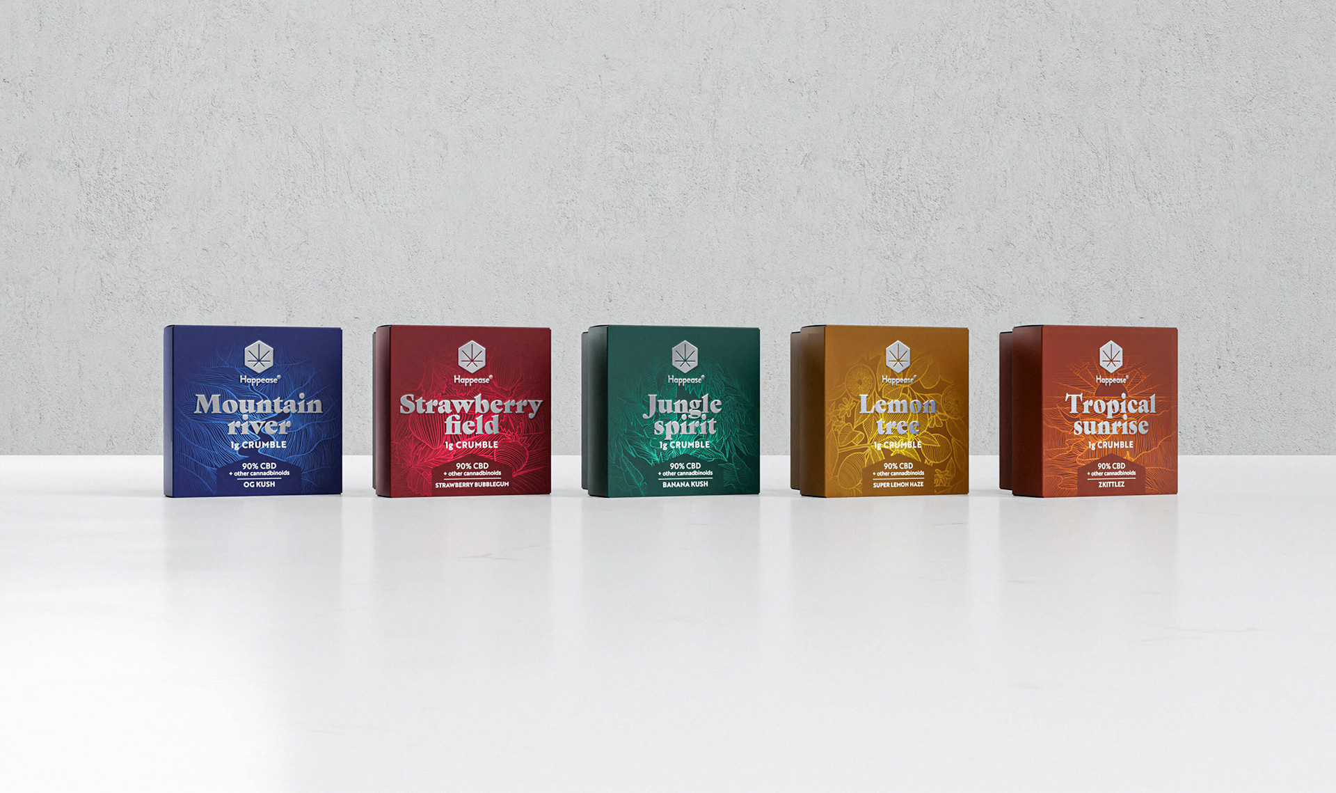
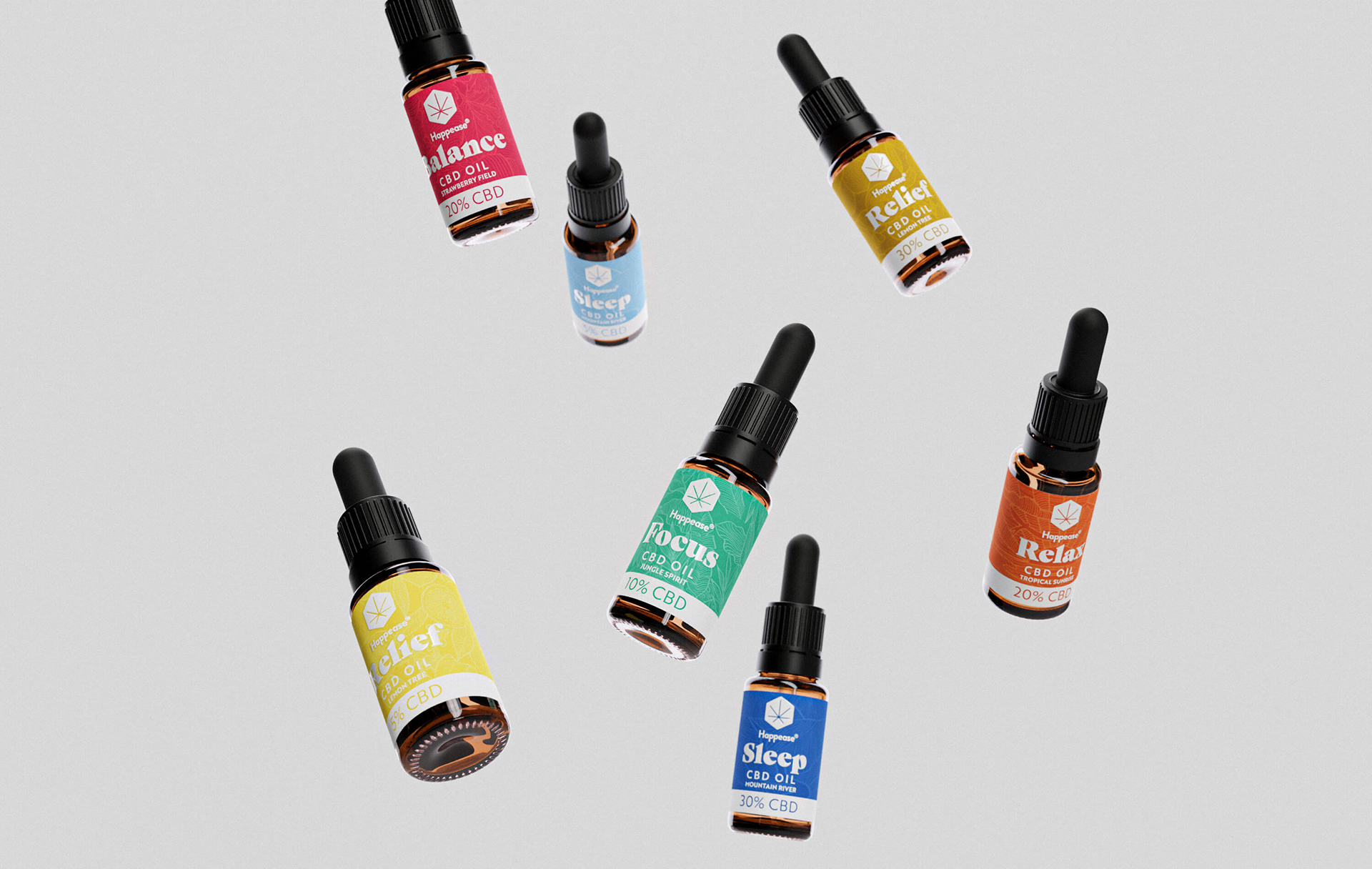
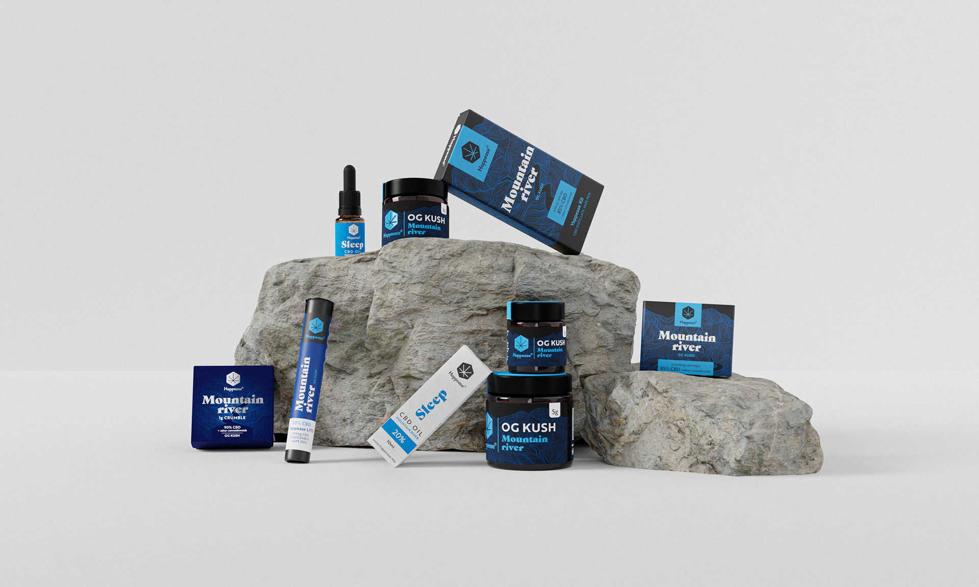
The base of the visual language stems from the client's wish to express a flavour or an emotion through each product pack. This was achieved through custom-made illustrations and a color-coding system that spans all ranges and product types.
In the beginning there was light...and a vape pen. This was the starting point of the visual identity, for which we developed a logo, a style of custom illustration and a packaging design system that builds on contrasts: darkness vs light, thin and delicate lines vs. full and sharp shapes, juicy and heavy typography for flavours vs. simple sans serif for technical texts.
The logo was born out of the idea that the CBD extract is the "honey of the cannabis plant," an idea that also was at the base of the mother company name Honeytime. Therefore, the logo icon is a hexagon that contains the abstracted base shape of a cannabis leaf.
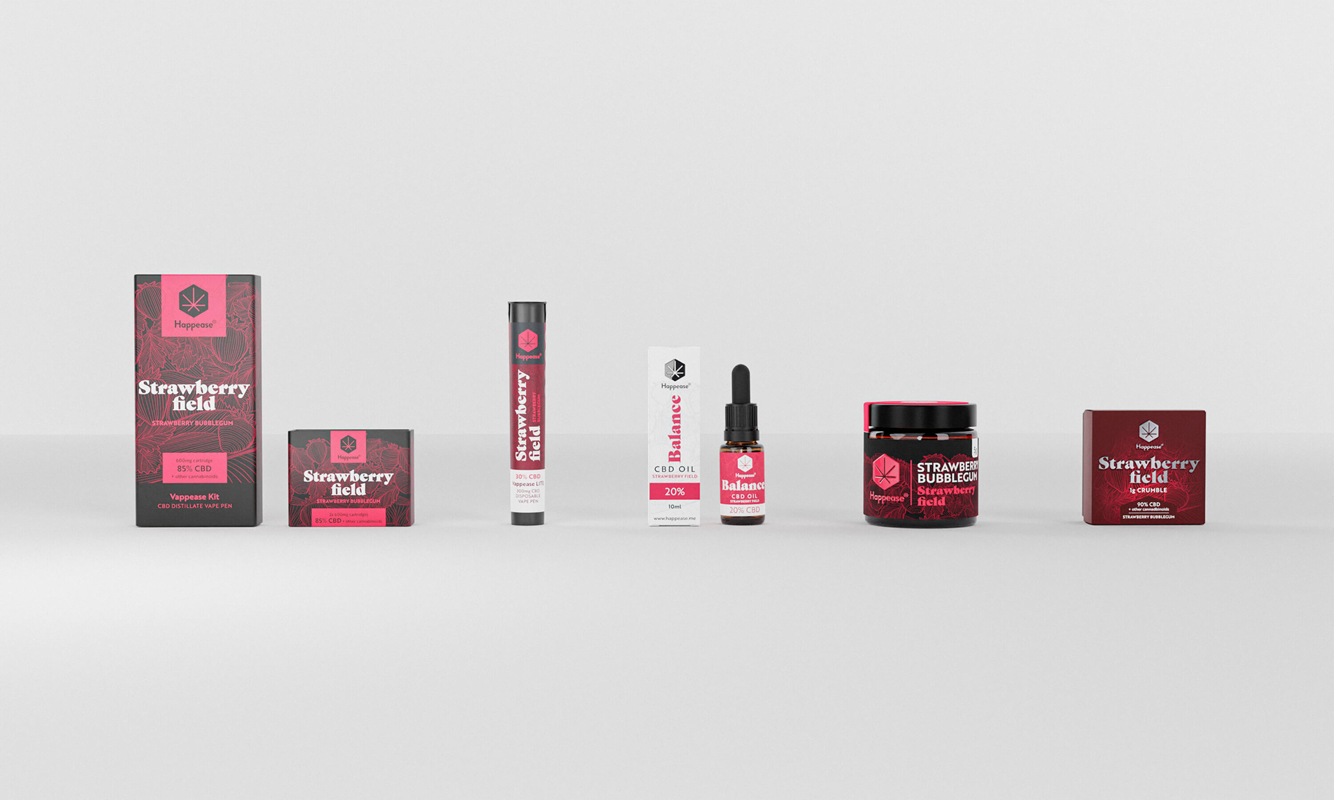
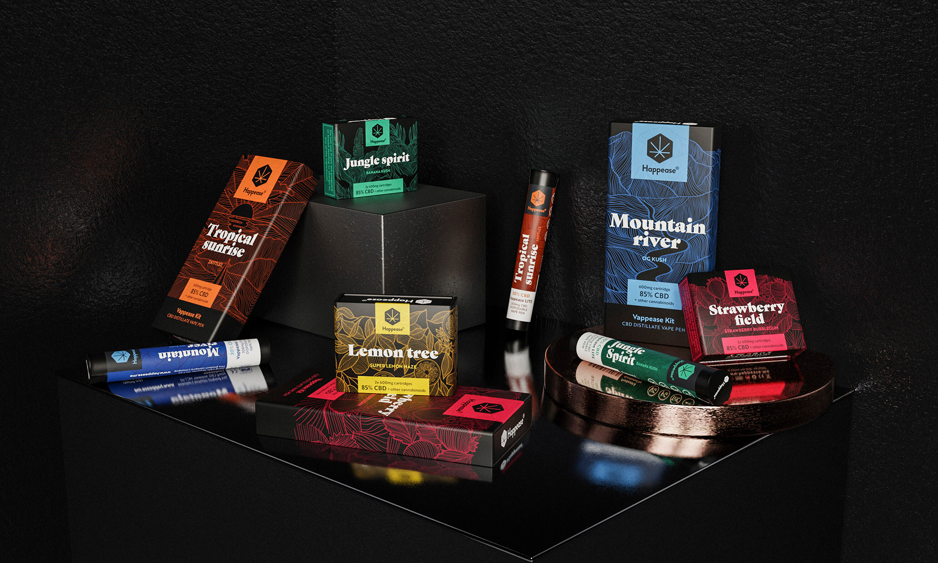
The line illustrations that appear on each pack are custom-made by us and they express either a taste, smell or state of mind that is in line with each product flavour. Currently, there are 5 different flavours in the Happease portfolio.